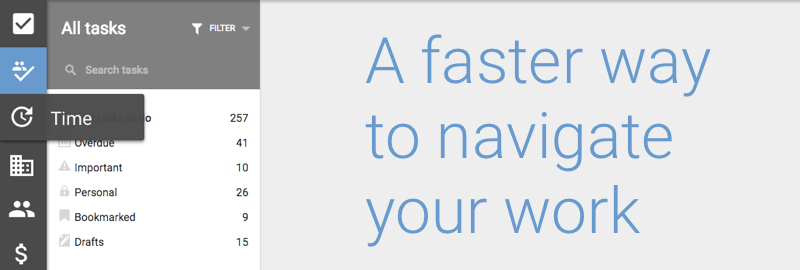
Today we have introduced several new improvements to the navigation within todo.vu. We have moved the primary section links from tabs in the top coloured bar to a new vertical sidebar menu on the left side of the screen. And along with this change, we have introduced some enhancements to overall navigation and searching within todo.vu.
We have now split the Tasks section into two new sections – Your tasks and All tasks. Previously we provided filters within the Tasks section that worked similarly but it required additional clicks to get to these filters. So you can now navigate to each of these points in one click from anywhere in todo.vu.
We have also improved the workflow state filtering so that it is now possible to see all tasks of all workflow states in the one view. This makes finding tasks easier and greatly improves the search functionality. The All tasks view acts a bit like an activity stream allowing you to quickly see all activity within your workspace across all users.
The new workflow state filter is also persistent within each of these two sections, so you can maintain a different filter for each section at the same time. Personally, I like to have Your tasks filtered for To Do tasks (this helps me focus on what I need to do), and All tasks filtered with no filter at all (so that I can monitor all activity in the workspace).
While reorganising the layout we have also moved the workspace settings menu to the bottom of the new sidebar and we have moved the notifications bell over to the far right of the workspace coloured bar.
All of this work frees up the to coloured workspace bar ready for our next exciting release only a few weeks away.

